A little spit shine
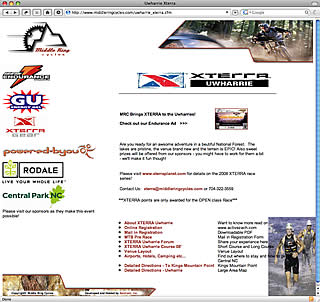
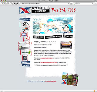
 One of the things I do is design. It started out as a hobby but has grown into a small business that provides a bit more income every now and then. It also allows me to grow in my design capabilities. I just finished up a redesign job for Xterra Uwharrie and thought I’d post the before and after pics here.
 One of the things that makes for good design is a logical flow of information on the page. Most clients that need a redesign have found their pages growing like monsters without good flow. They just add another piece here and there until it has grown into a huge, disorganized mess. Good design fixes that by drawing the eye to what matters most. One this redesign, the red font draws the eye to the date at the top first, and the sponsors on the left second. In the original design, the eye has no boundaries and therefore, no direction to follow.
Anyway, click the thumbnails for a closer look at the before and after screenshots.


Leave a Comment